Corventis
Corporate culture
retold and redesigned
Personality lies in the design
“Everything new”, sings Peter Fox in Berlin. Yes, everything! replies a personnel consultancy in Ravensburg. Instead of a wrecking ball, however, it moves into new premises and refurbishes its corporate design, website, letterheads and textual appearance. The brand redesign additionally boosts motivation at the new location. What follows is corporate culture and communication like in a picture book.
Leadership positions squared
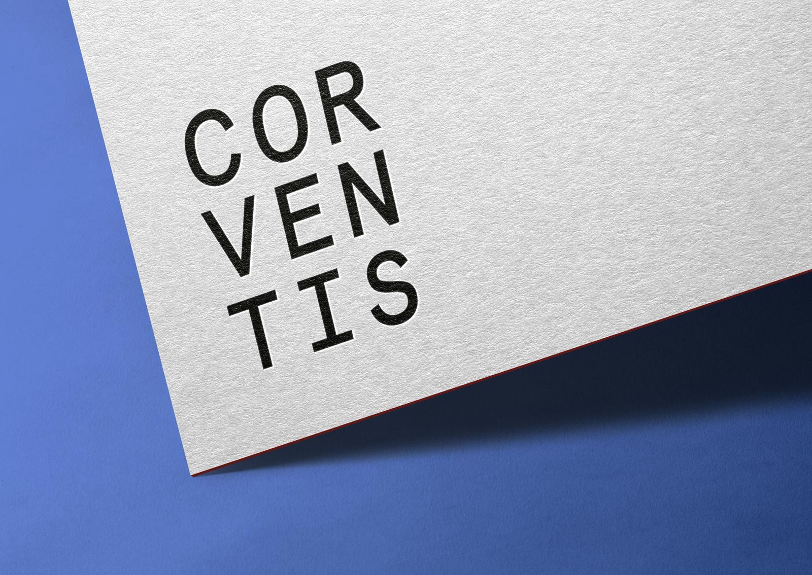
The name should remain, the brand recognisable. Everything else: Make it new! In strategic analysis and consulting, we can only say: that’s right. The target group needs it to be stimulating and at the same time serious and upscale. The redesign in black and white with velvet red and inky blue accents sets the right framework for this. The square logo speaks of a clear attitude and tells of the search for the right people for open management positions. For those with little time, a new claim brings this to the point: Corventis finds personalities.
News must also look new
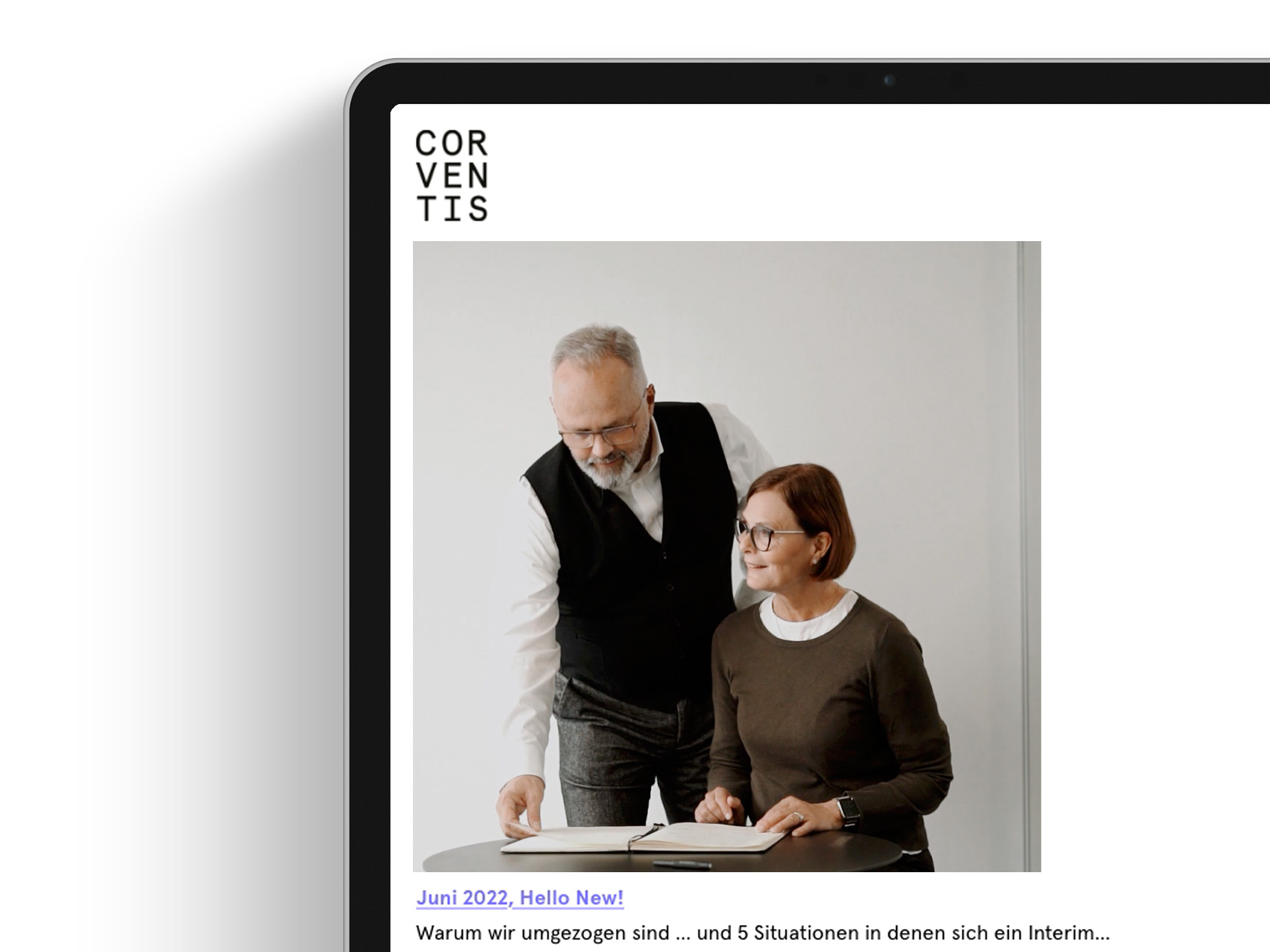
The carpet is rolled out in the new location and the first newly designed newsletters are already fluttering out of the reel. The strategic customer approach continues. Interviews and other new formats as well as a fresh, sometimes provocative tone make applicants and companies want to meet – with Corventis in the middle.
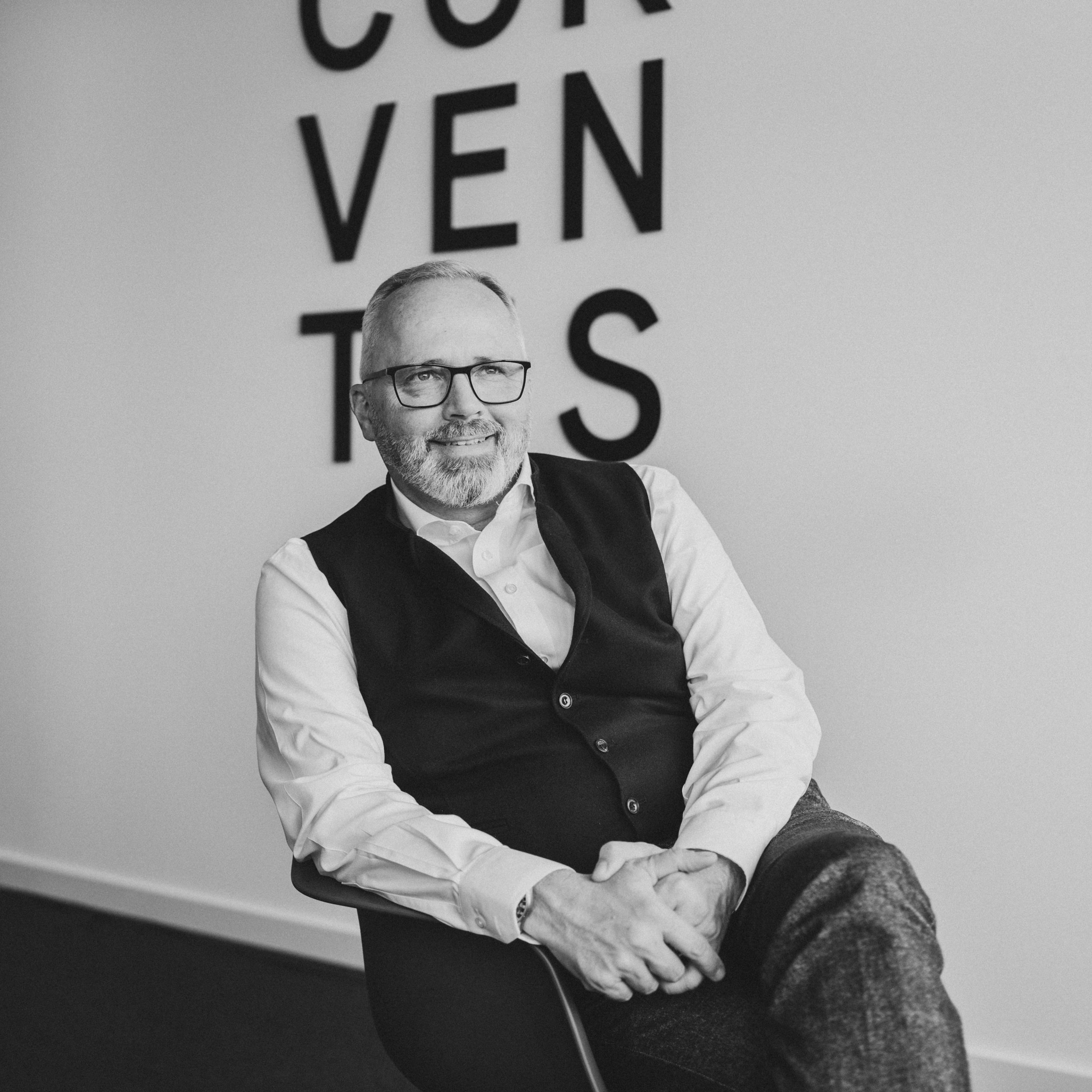
Strong characters, multimedia staged
For particularly characterful photos and portrait films, we direct the staff shoot, which is also celebrated as a team day. From the camera, everyone goes to the interview appointment. Through the double flower reading, close employee profiles are created. Meanwhile, our filmmakers move to the studio and selected locations and shoot video miniatures for web and social media that illustrate the company’s values with atmospheric close-ups.
Online goes new ways
The square remains the measure of all things, also in web design. The result is a flexible set box system in which everything finds its place – just like the candidates in the company. Playful details bring additional movement into the user path, interaction increases. The need for information is satisfied in completely restructured and reformulated content: from the service portfolio to the mission statement to the company profile, we find concrete and clearly addressed words.
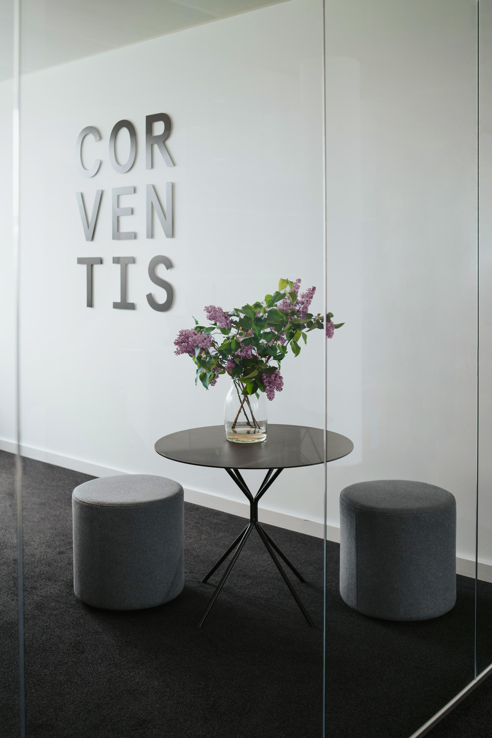
Office design as a brand message
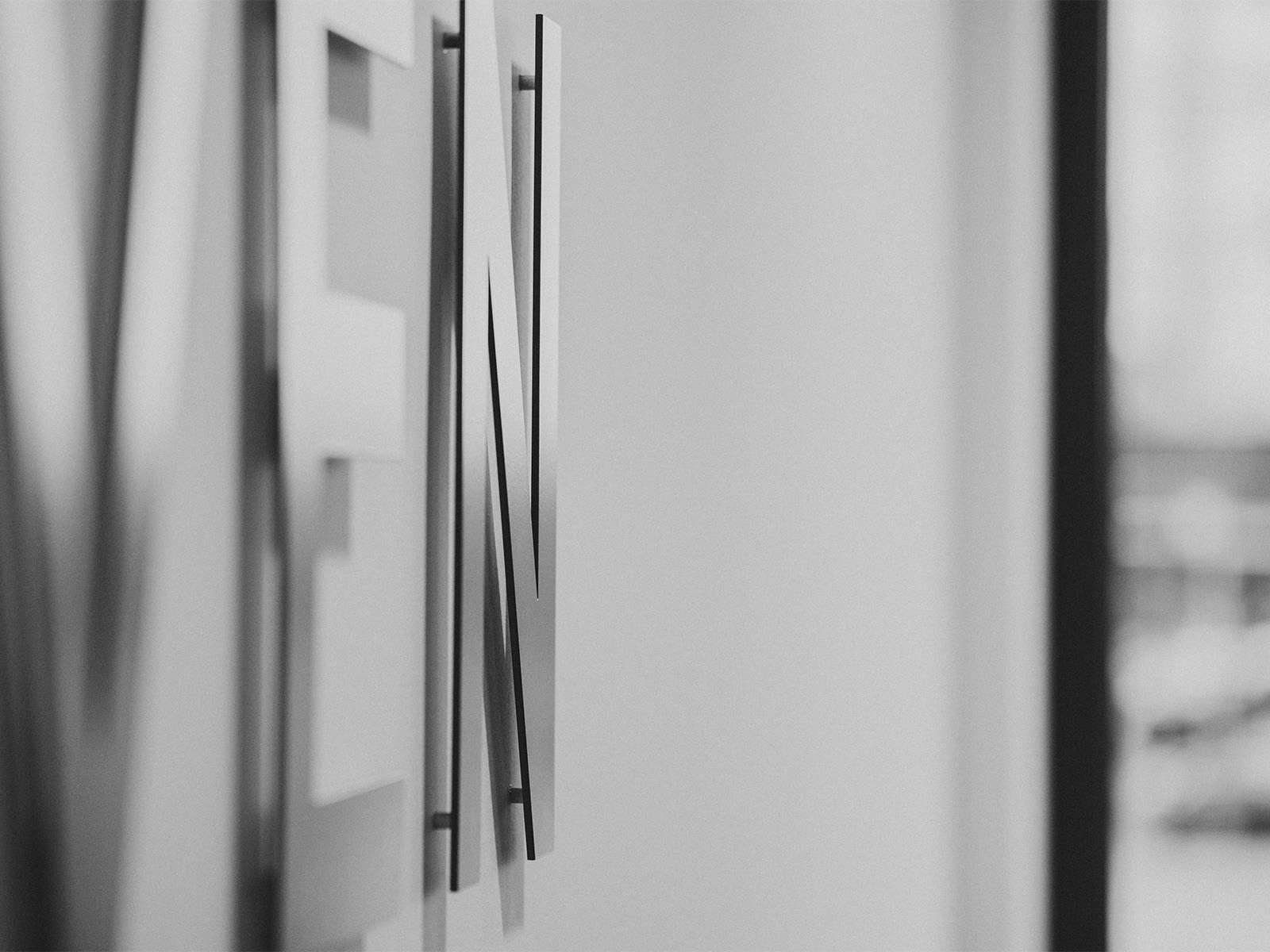
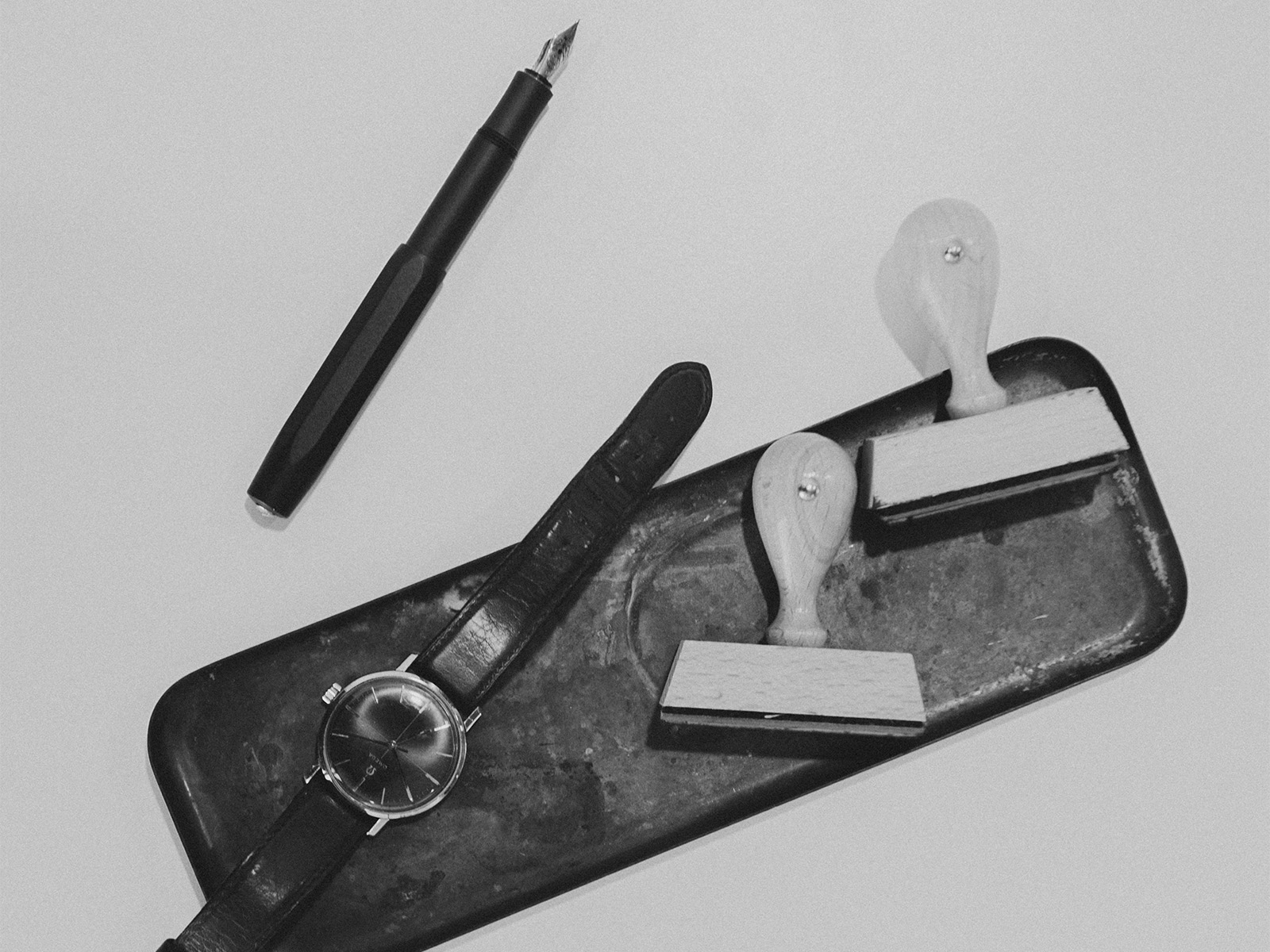
Everyone passes by: a large-format logo in metal letters at the new company headquarters. The corporate design was integrated into the architecture, adding valuable details. From the reception to the view of the guidance system and the privacy screen on the glass partitions, to the newly designed stationery and branded office utensils and giveaways – visitors now follow the company along a clear design path.
