BZM
Significant characters
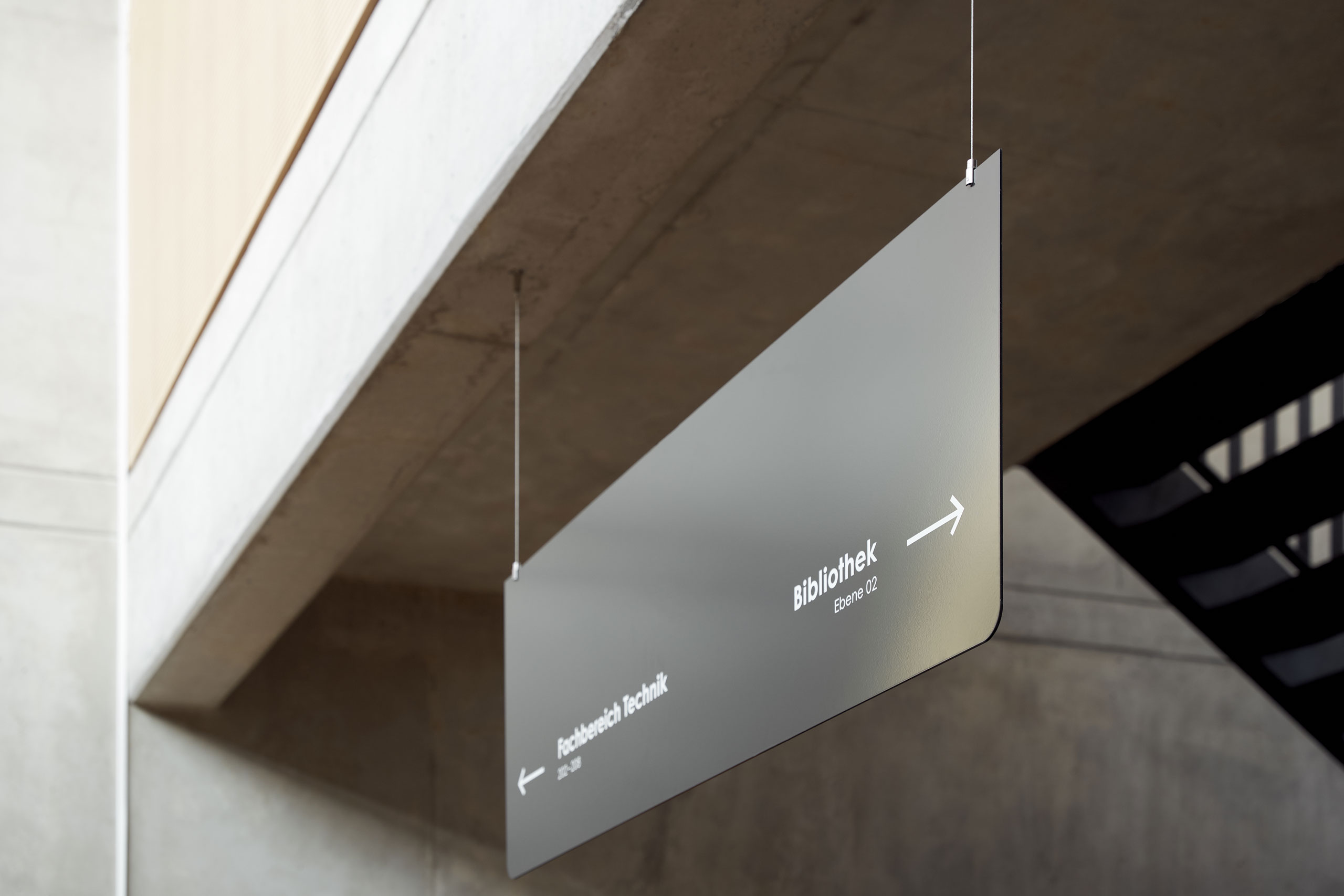
What do teachers, pupils and signalling have in common? They are often, in their own unique way, the unobtrusive heroes of everyday life! From signposts and signs to pictograms and signage – signage guides us through the labyrinths of everyday life and creates orientation, and order in the chaos. It serves not only as an aesthetic element, but also as an indispensable source of information that navigates us safely through complex environments – as was the case at the BZM in Markdorf near Lake Constance, which we had the privilege of enriching with a well thought-out guidance system integrated into the existing architecture and surroundings.
Significant characters
The school day is colourful, so a clear line is needed. So centimetre by centimetre, simple and cool, from the outside to the inside, important information is presented on the most diverse levels – at all neuralgic points. The design is also characterised by graphically reduced elements, which are reflected in both the typeface and the icons. Existing façade structures on ceilings, floors, walls and free-standing stelae are skilfully taken up and combined with new elements of signage. The guidance system makes it easy to find one’s way both inside and outside the school building. The clear and well thought-out lines provide orientation and support efficient navigation for pupils, teachers and visitors alike.
For more identity
The materials chosen are based on the existing architecture and fit into the design language of the building. They were also chosen for their ease of handling and processing. Oak wood elements, translucent privacy films and white lettering on powder-coated sheet steel dominate here. A highlight within the guidance system are the glass privacy screens with alpine silhouettes covered in white decorative foil. They visually separate the rooms and at the same time form a connecting element that creates a link to the region.
Significant sign language
What do pictograms have to do with product design? Quite a lot, if you look at our implementation for the BZM. Everything that can and should be a contact point inside and outside the building was given a meaningful icon with a long-distance effect: whether sports hall, technical rooms or sanitary facilities – canteen or e‑bike parking space. Modern and at the same time timeless. A graphically unmistakable stamp that we put on the Markdorf Education Centre with our holistic graphic concept and which became an integral part of the school’s corporate identity.
You like this? Then feel free to share it:
You like that?
Then feel free to share it:


