BWB
Under the surface
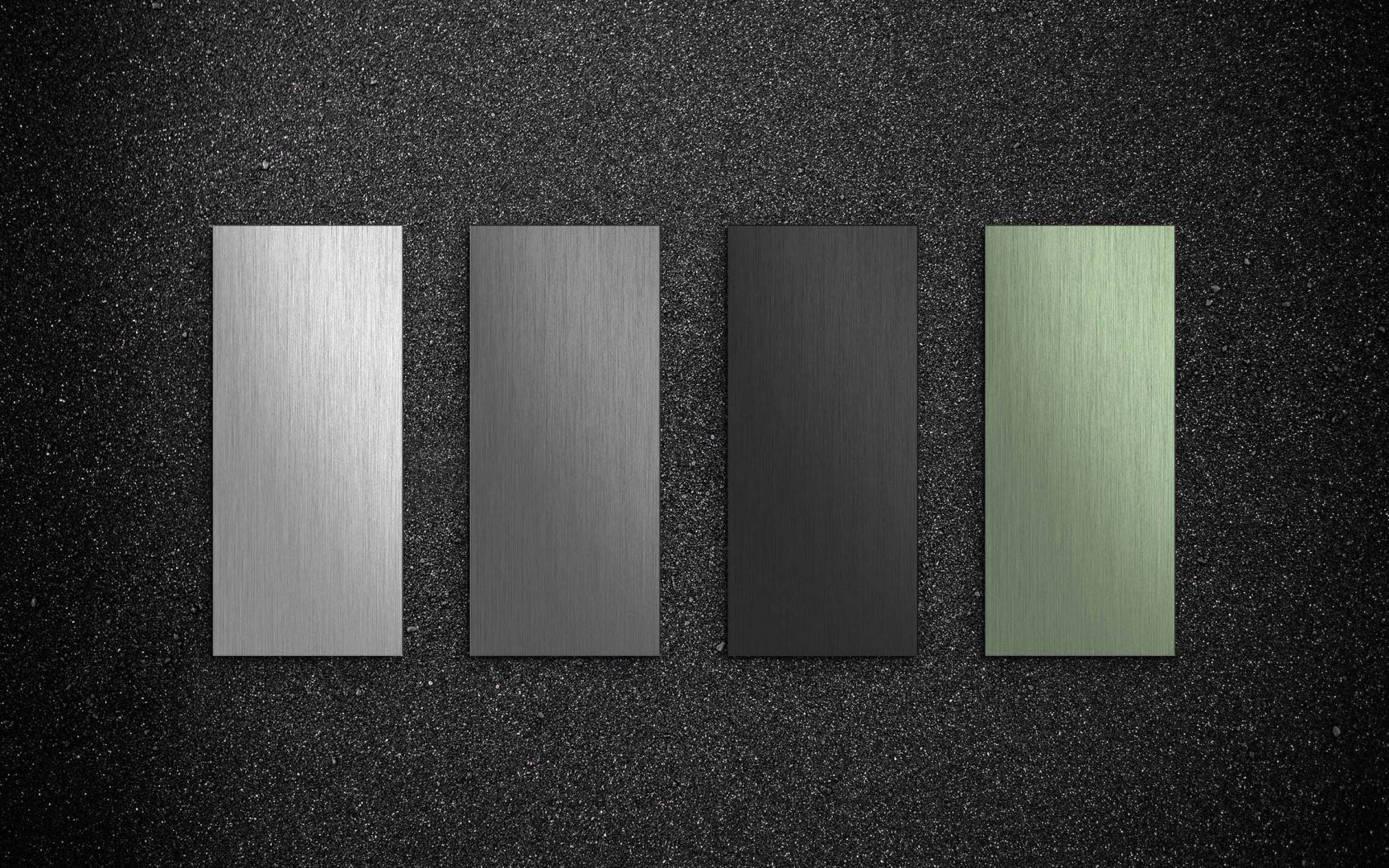
From the design to the building – from the sketch to the façade: as a specialist in surface treatments for aluminium, BWB offers a wide range of high-quality (aluminium) finishes and colour variants. With the market launch of Permagrey, the company has presented an innovative colour spectrum in timelessly elegant anthracite tones, with which architectural visions can be individually realised. For Permagrey and the Color Collection 01, we developed a coherent target group approach as well as a concise key visual. One that allows the viewer to immerse themselves tangibly in the BWB product world. This is also the case with the Color Collection 02, another selected colour range that gives outer shells functional effectiveness and glossy aesthetics.
Timelessly aesthetic
Aluminium components that permanently withstand even extreme weathering: With the product launch of Permagrey, BWB brings both durability and variance and diversity to the design of façades. We have made sure that the message reaches where it should – the architects. With a trustworthy language and attractive imagery. And because the design of buildings affects us all, we have put together the Color Collection 01, a coordinated range of colours that transform aluminium surfaces into colourful highlight materials, for example in our urban environment.
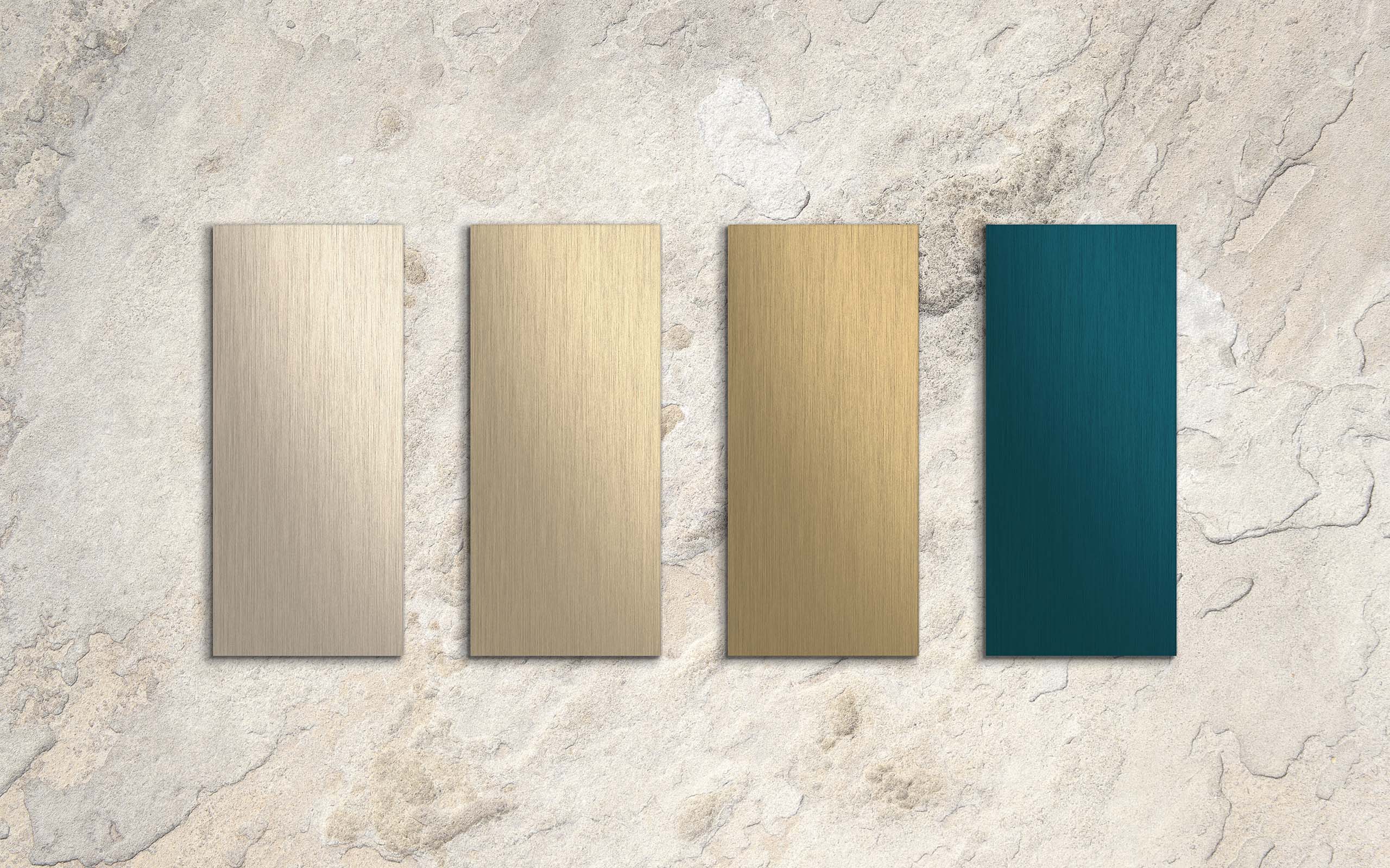
And with the Color Collection 02, building envelopes outside the common standard can also be realised. With the four colours from the Colinal®, Bronze and Sandalor® palette, powerfully elegant architectures are created that underline the possibilities of innovative façade design. Functional beauty that is already visible from afar and also delights in detail with precision and colour brilliance.
See. Marvel. Touch
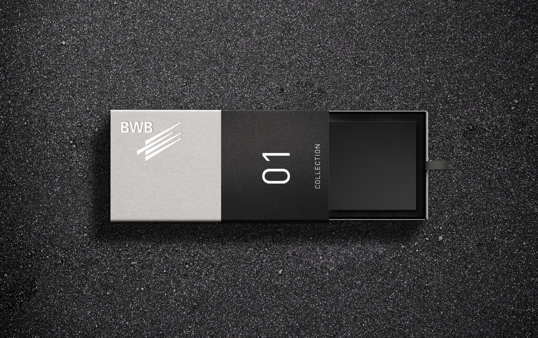
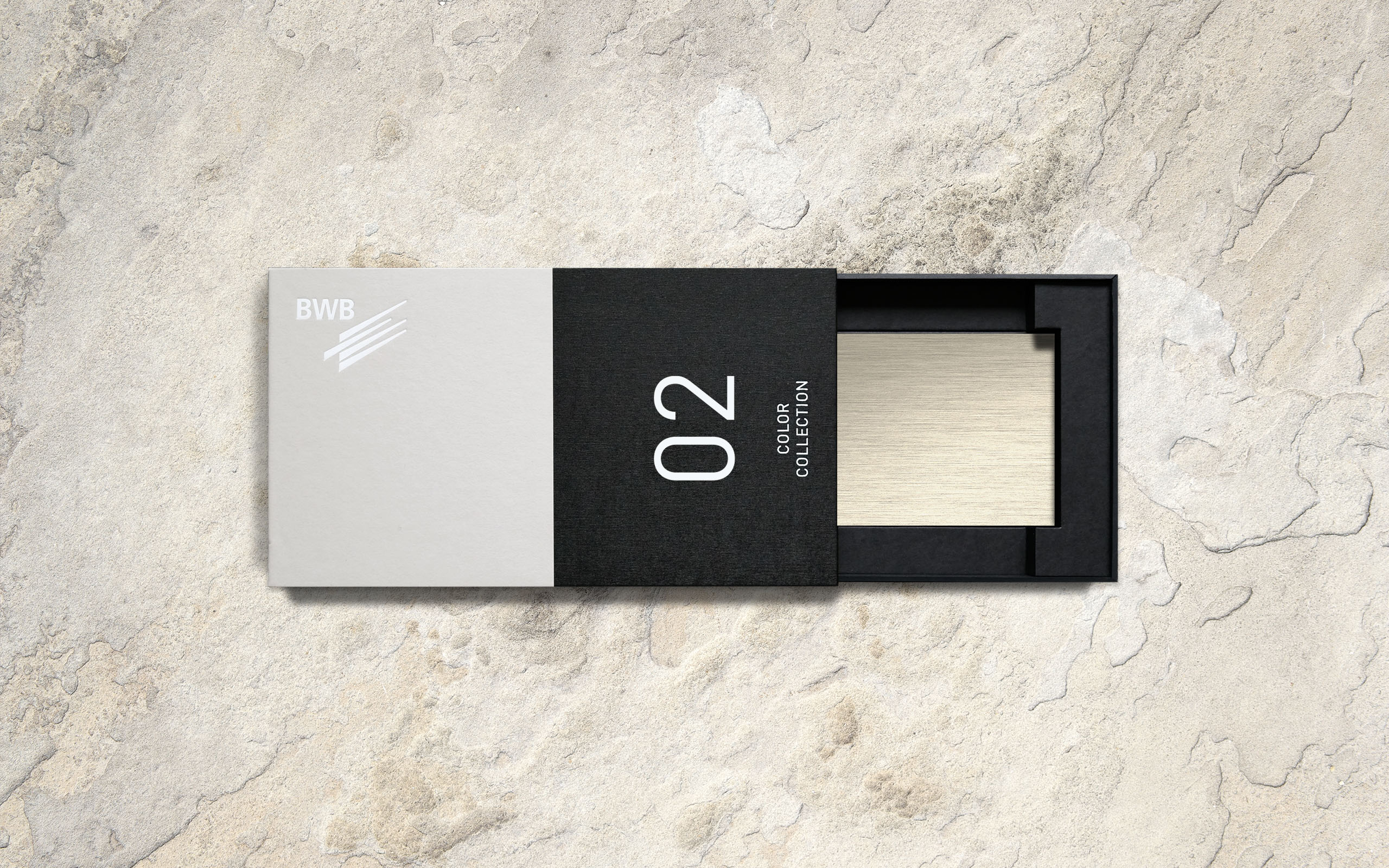
Architects and designers are people of the senses. For the market launch of the Color Collection, we therefore developed packaging that brings the timeless aesthetics of the products to the fore, both visually and haptically. The result is a stylish sample box that presents four selected colours for each of the first and second collections in the form of slim sample plates. See. Be amazed. Touch. And be inspired.
Wonderfully changeable
Anodising with Permagrey does not scratch the surface – it changes in depth. Lasting and durable. To depict these attributes authentically, we literally dived in with our key visual. We placed the physical manufacturing process at the centre of the scene as an aesthetic moving image and thus made the transformation of the unprotected metal into durable Permagrey aluminium a visual experience.
Fabulously digital
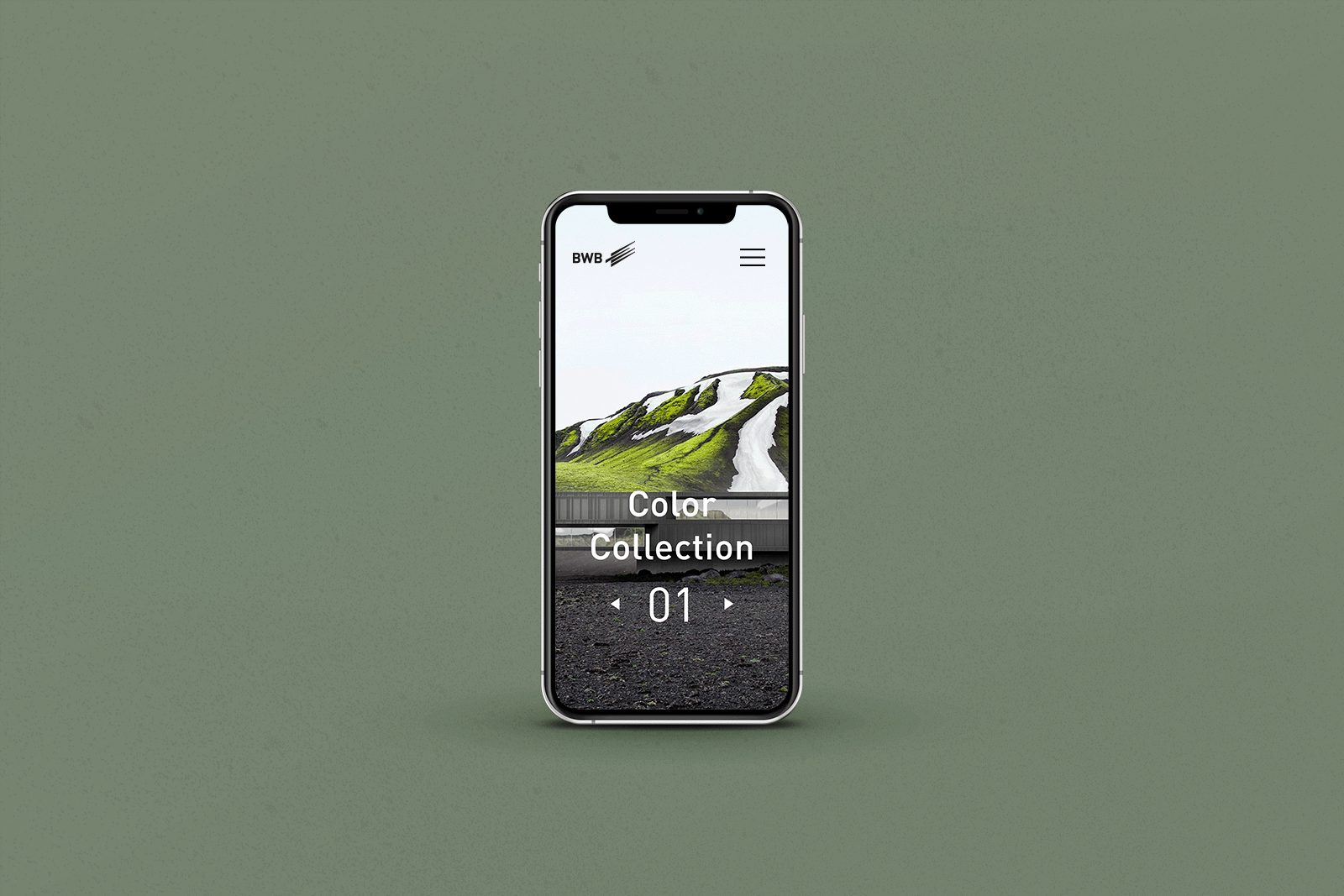
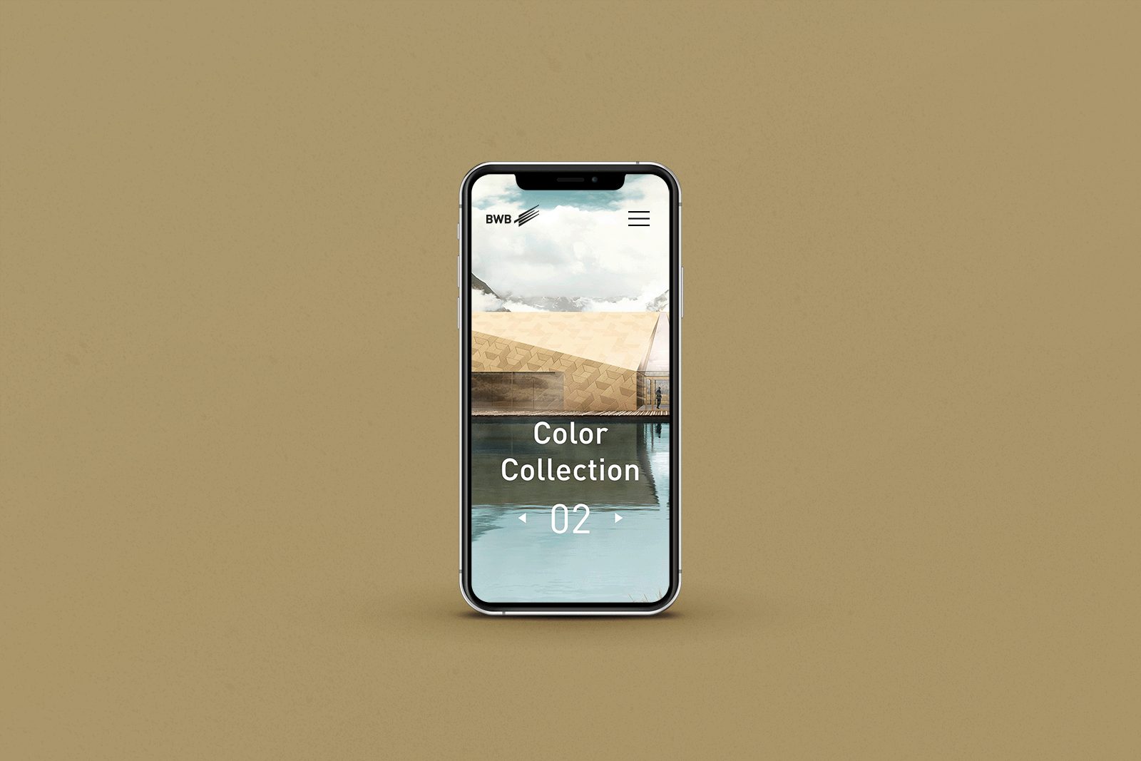
Every product deserves a stage worthy of it. In order to bring the Color Collection to the architects in a targeted way, we designed a style guide for a landing page that puts the collection in the spotlight in style. With catchy texts and expressive images that underline the quality and durability of the product in a special way. Coordinated with the newsletter, banners and social media presence – for a consistent and meaningful overall communication.
Finely painted
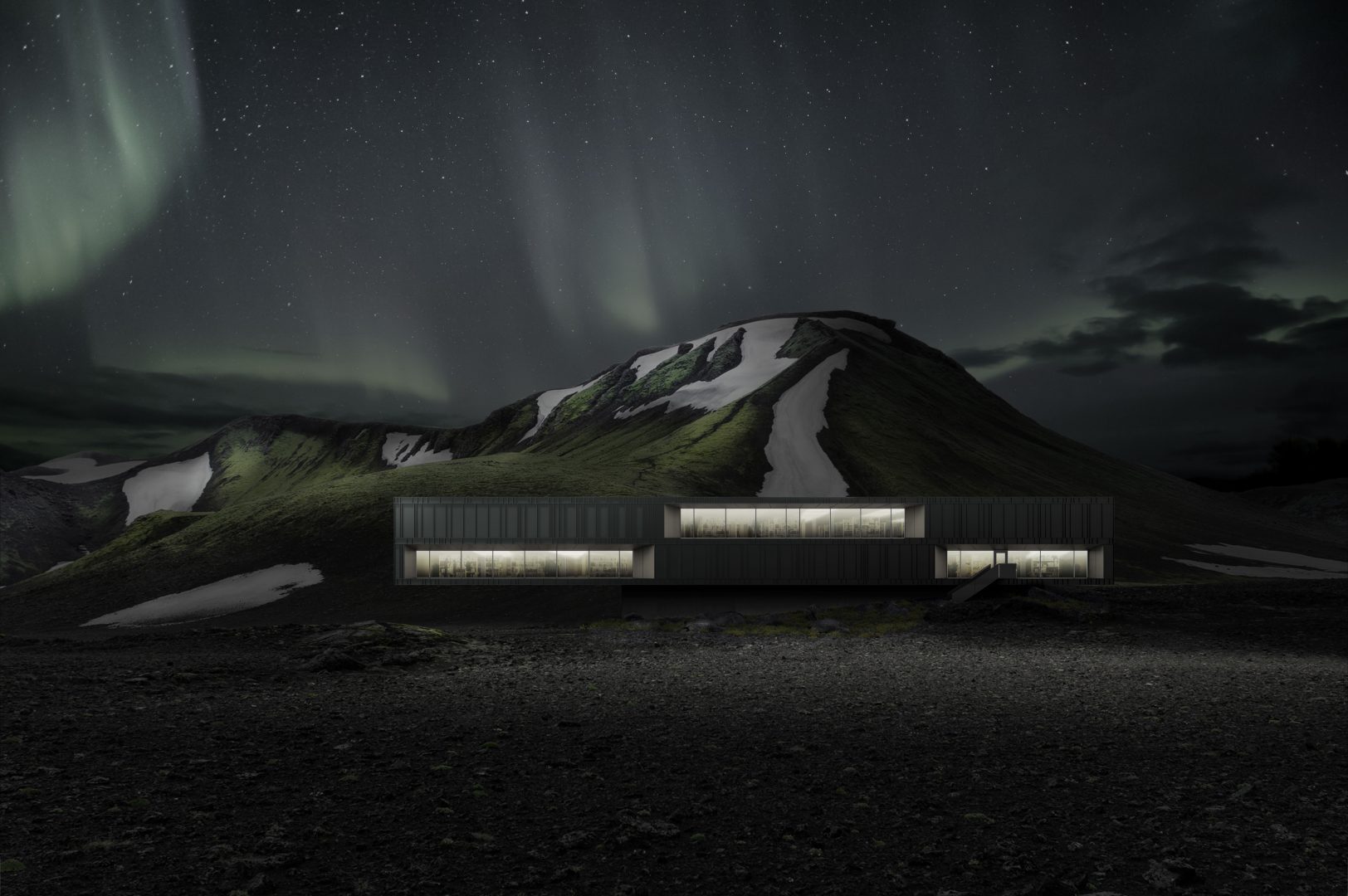
Aluminium surfaces as concept-defining elements of current building culture: even supposedly rough stretches of land are home to iconographic architecture. Visually represented with a spherical-looking architectural rendering, embedded in the unpolished landscape on the North Atlantic, we communicate the longevity of the façade product of the Color Collection 01 to the point. With the Color Collection 02, on the other hand, aluminium components become strong façade elements with radiance.
You like this? Then feel free to share it:
You like that?
Then feel free to share it:
