
Promega
Fortschritt
durch
Identität
Das weltweit agierende Unternehmen Promega stellt innovative Lösungen und technische Unterstützung für die Life Science Research-Industrie zur Verfügung. Angetrieben durch Neugierde und begeistert durch Forschung unterstützt Promega so seit fast einem halben Jahrhundert Wissenschaftler*innen weltweit. Eine spannende und zugleich wegweisende Branche. Wegweisend ist nun auch das Leitsystem auf dem neuen Firmenareal und in den neuen Räumlichkeiten.
Richtungsweisende Kommunikation
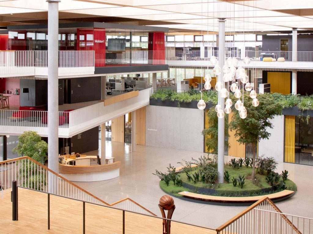
Ob in einer Universität, einem Museum oder in einem Bürogebäude. Ob Besuchende oder Mitarbeitende – in jedem Unternehmen kann die Frage auftauchen „Wo geht’s eigentlich lang?“. Bereits während der Rohbauphase ihres deutschen Headquarters in Walldorf im Rhein-Neckar-Kreis, bat uns Promega um Unterstützung. Gewünscht war ein Gesamtkonzept für ein Wegeleitsystem für den Innen- und Außenbereich inklusive Sportgeländepfad. Und auch beim Thema Durchlaufschutz musste eine intelligente wie dauerhafte Lösung her. Wir lieferten effiziente wie einprägsame Antworten, die sich gekonnt in die vorhandenen Strukturen einbetten und diese 2- und 3‑dimensional ergänzen.


Hier entlang!
Klare Linien für einfache Orientierung im 3‑dimensionalen Raum. Entstanden sind visuelle Orientierungshilfen. Auf der Basis von eigens dafür entworfenen Stehlen und architektonischen Oberflächen finden sich Schriften und Piktogrammen, die ohne groß Aufsehen zu erregen zielgerichtet durch alle Dimensionen des Unternehmens führen. Über den Parkplatz bis ins Foyer. Vom Keller bis unters Dach. Über den hauseigenen Sportgeländepfad hinweg bis zum Anlieferungsareal. Inspiriert von bestehenden vertikalen Strukturen innerhalb des Gebäudes entwickelten wir außerdem zusätzlich Barcode-ähnlichen Durchlaufschutz, der die grafische Verbindung zur fachlichen Identität des Unternehmens schafft.
Signifikante Zeichensprache
Was Piktogramme mit Produktdesign zu tun haben? Eine ganze Menge, wenn man sich unsere Umsetzung für Promega vor Augen führt. Alles, was innerhalb und außerhalb des Gebäudes Anlaufpunkt sein kann und soll, bekam von uns ein aussagekräftiges Icon mit Fernwirkung: ob Sportraum, Schließfachanlage oder Sanitärbereich – Taxizone oder E‑Bike-Stellplatz. Modern und zugleich zeitlos umgesetzt. Ein grafisch unverkennbarer Stempel, den wir Promega mit unserem ganzheitlichen Grafikkonzept aufgesetzt haben und der zum integrativen Bestandteil der Corporate Identity des Unternehmens wurde.


Dir gefällt das? Dann teile es gerne:
Dir gefällt das?
Dann teile es gerne: