
BWB
Unter der Oberfläche
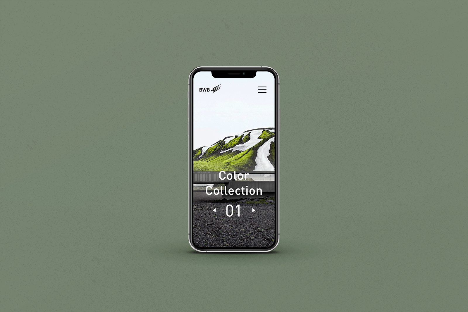
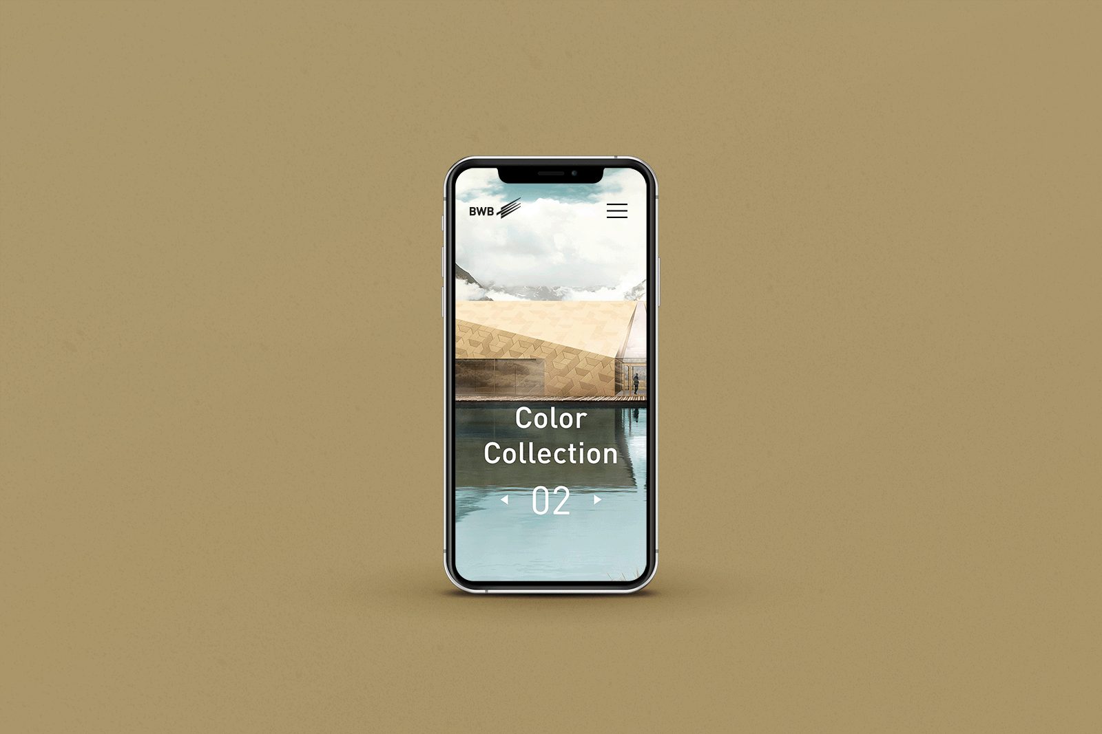
Vom Entwurf zum Gebäude – von der Skizze zur Fassade: Als Spezialist für Oberflächenbehandlungen von Aluminium bietet BWB ein breitgefächertes Spektrum hochwertiger (Aluminium-)Veredelungen und Farbvarianten. Mit der Markteinführung von Permagrey hat das Unternehmen ein innovatives Farbspektrum in zeitlos-eleganten Anthrazittönen präsentiert, mit denen sich architektonische Visionen individuell verwirklichen lassen. Für Permagrey und die Color Collection 01 haben wir eine stimmige Zielgruppenansprache sowie ein prägnantes Keyvisual entwickelt. Eines, das die Betrachtenden spürbar in die Produktwelt der BWB eintauchen lässt. So wie mit der Color Collection 02, einem weiteren ausgewählten Farbsortiment, das äußeren Hüllen funktionale Wirksamkeit und glänzender Ästhetik schenkt.
Zeitlos ästhetisch
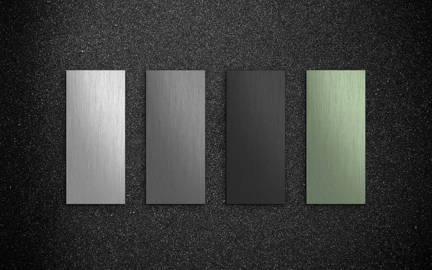
Aluminiumbauteile, die selbst extremer Witterung dauerhaft standhalten: Mit der Produkteinführung von Permagrey bringt BWB sowohl Beständigkeit als auch Varianz und Vielfalt in die Gestaltung von Fassaden. Wir haben dafür gesorgt, dass die Botschaft dort ankommt, wo sie ankommen soll – bei den Architekt*innen. Mit einer vertrauenswürdigen Sprache und anziehenden Bildwelten. Und weil Gestaltung von Gebäuden uns alle betrifft, haben wir mit der Color Collection 01 ein aufeinander abgestimmtes Farbsortiment zusammengestellt, mit dem sich Aluminiumoberflächen, zum Beispiel in unserem urbanen Umfeld, in farbige Highlight-Materialien verwandeln.
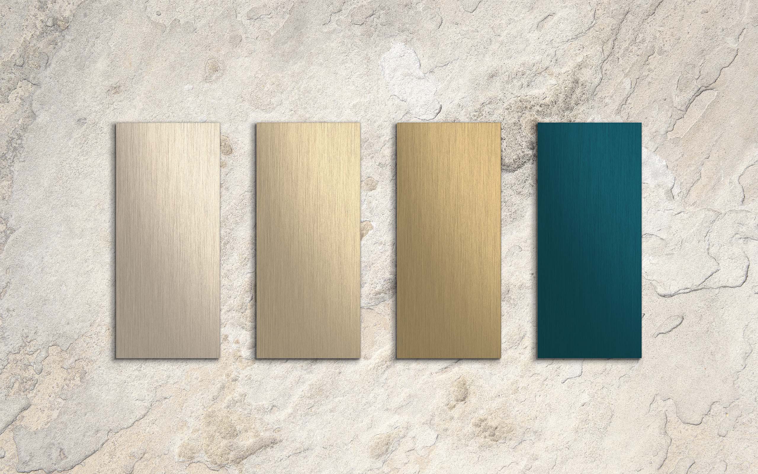
Und auch mit der Color Collection 02 lassen sich Gebäudehüllen außerhalb des gängigen Standards realisieren. Mit den vier Farbtönen aus der Colinal®-, Bronze- und Sandalor®-Palette entstehen kraftvoll elegante Architekturen, welche die Möglichkeiten innovativer Fassadengestaltung unterstreichen. Funktionale Schönheit, die bereits von Weitem ersichtlich ist und auch im Detail mit Präzision und farblicher Brillanz erfreut.
Sehen. Staunen. Anfassen
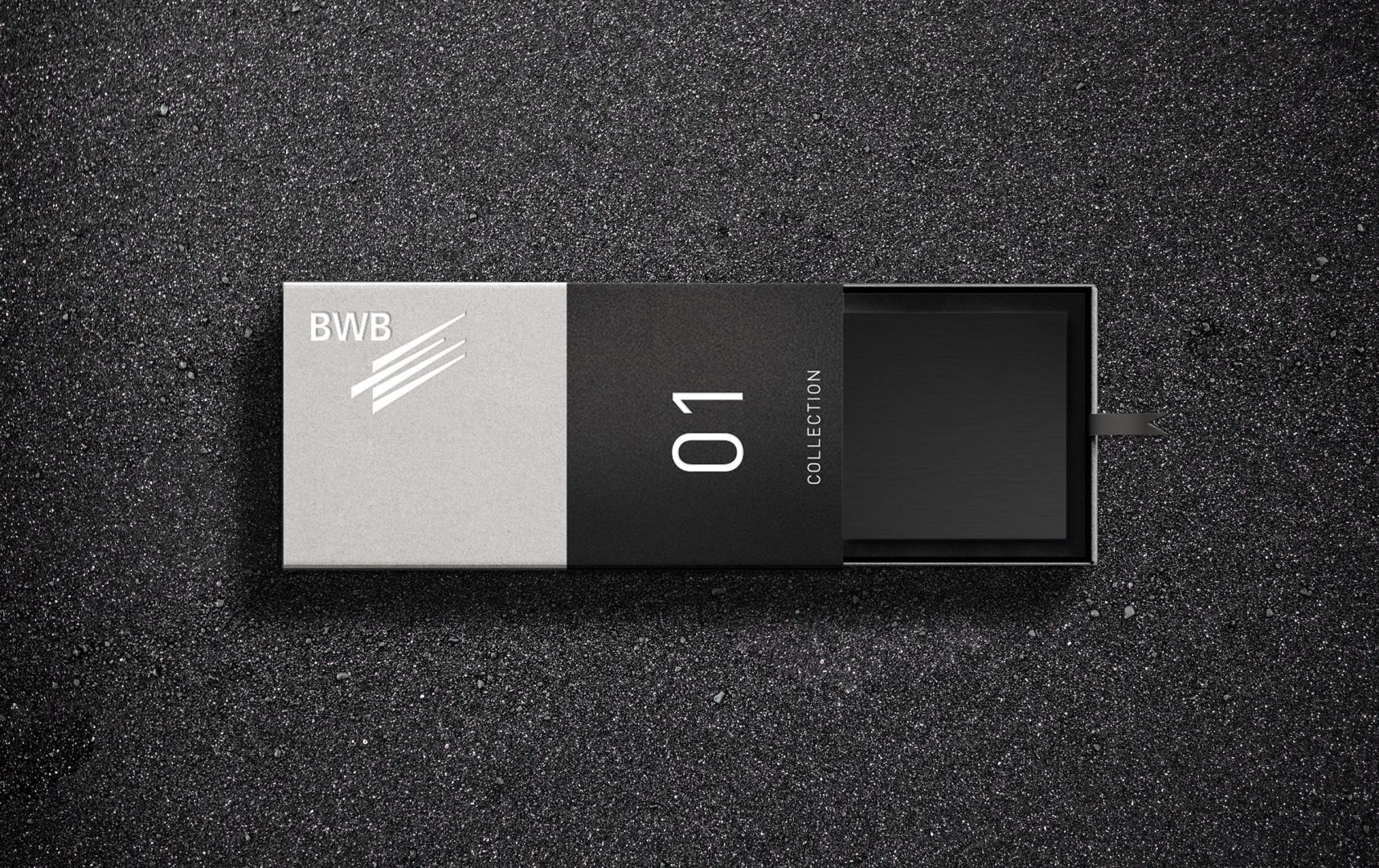
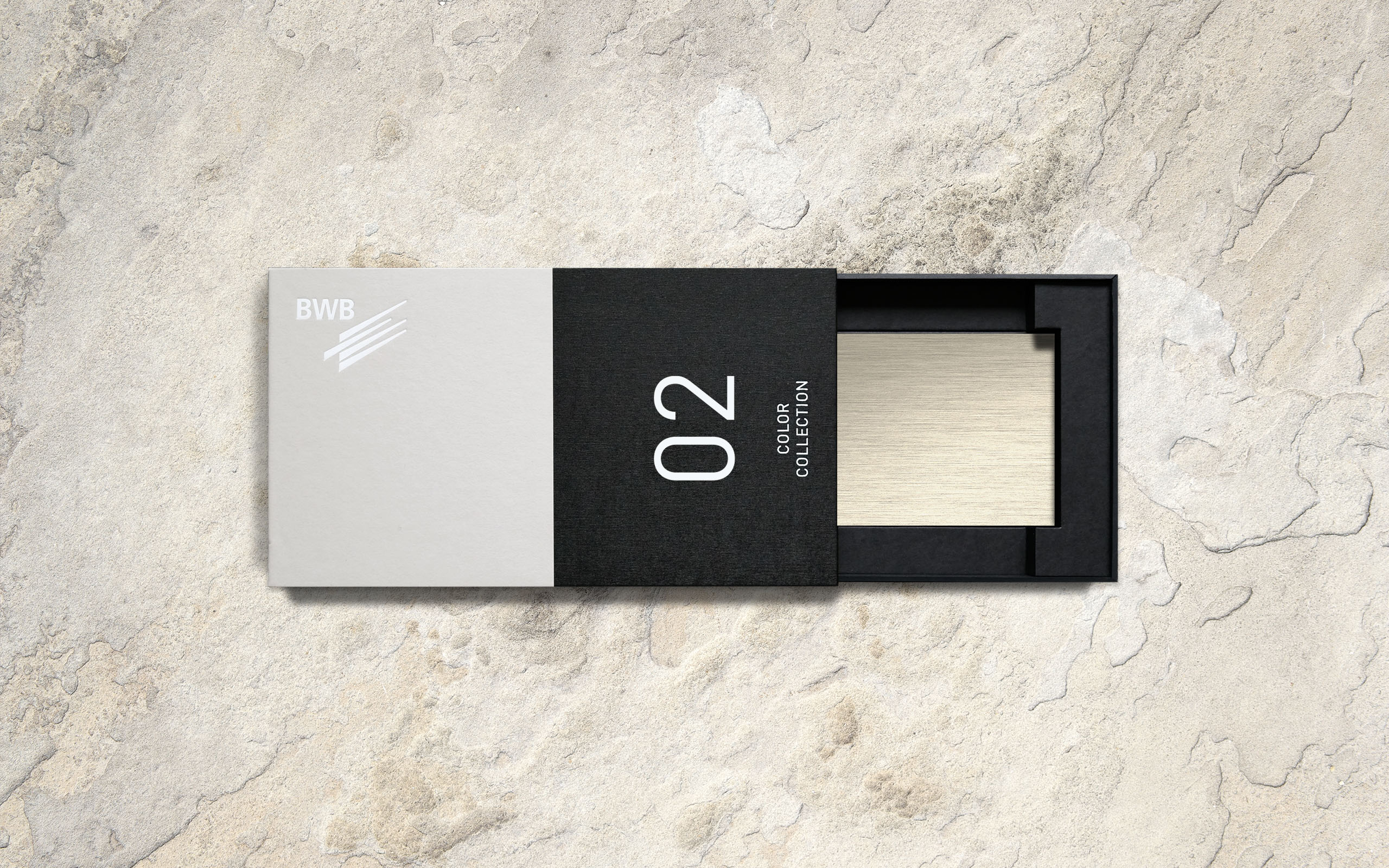
Architekt*innen und Gestalter*innen sind Sinnesmenschen. Für die Markteinführung der Color Collection haben wir deshalb ein Packaging entwickelt, das sowohl visuell als auch haptisch die zeitlose Ästhetik der Produkte in den Vordergrund rückt. Entstanden ist eine stilvolle Sample Box, die für die erste und zweite Kollektion jeweils vier ausgewählte Farben in Form von schlanken Musterplatten präsentiert. Sehen. Staunen. Anfassen. Und sich inspirieren lassen.
Wunderbar wandelbar
Eloxieren mit Permagrey kratzt nicht an der Oberfläche – es verändert in der Tiefe. Nachhaltig und dauerhaft. Um diese Attribute authentisch abzubilden, tauchten wir mit unserem Keyvisual im wahrsten Sinne des Wortes ein. Stellten den physikalischen Herstellungsprozess als ästhetisches Bewegtbild in den Mittelpunkt der Szenerie und machten so die Umwandlung des ungeschützten Metalls in beständiges Permagrey-Aluminium visuell erlebbar.
Sagenhaft digital
Jedes Produkt hat eine Bühne verdient, die seiner würdig ist. Um die Color Collection zielgerichtet an den Architekten zu bringen, konzipierten wir einen Styleguide für eine Landingpage, die die Kollektion stilvoll ins Rampenlicht rückt. Mit einprägsamen Texten und ausdrucksstarken Bildern, die die Qualität und Langlebigkeit des Produkts auf besondere Weise unterstreicht. Abgestimmt dazu Newsletter, Banner und Social Media-Präsenz – für eine einheitliche und aussagekräftige Gesamtkommunikation.
Fein gemalt
Aluminiumoberflächen als konzeptprägende Elemente aktueller Baukultur: Auch vermeintlich raue Landstriche beherbergen ikonografische Architektur. Visuell dargestellt mit einem sphärisch anmutenden Architekturrendering, eingebettet in die ungeschliffene Landschaft am Nordatlantik, kommunizieren wir die Langlebigkeit des Fassadenprodukts des Color Collection 01 auf den Punkt. Mit der Color Collection 02 werden Aluminiumbauteile hingegen zu starken Fassadenelementen mit Strahlkraft.

Dir gefällt das? Dann teile es gerne:
Dir gefällt das?
Dann teile es gerne: