
Promega
progress
through identity
Promega is a global company providing innovative solutions and technical support to the life science research industry. Driven by curiosity and inspired by research, Promega has been supporting scientists worldwide for almost half a century. An exciting and at the same time groundbreaking industry. The signage system on the new company grounds and in the new premises is now also groundbreaking.
Trend-setting communication
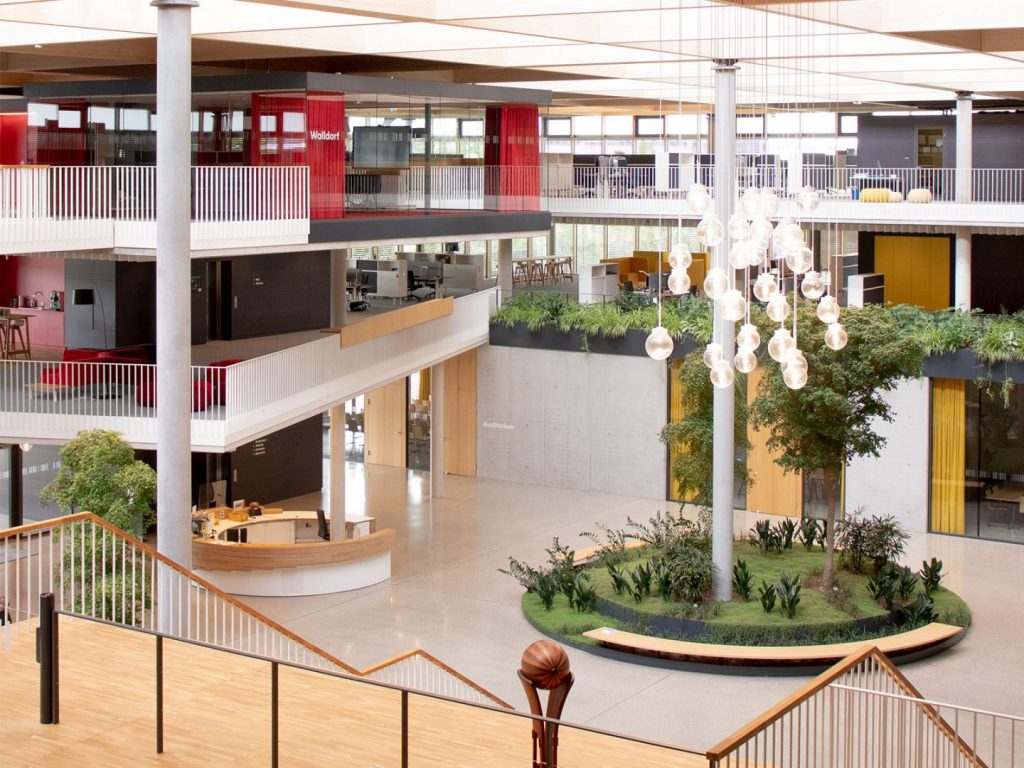
Whether in a university, a museum or an office building. Whether visitors or employees – in every company, the question “Which way is it?” can arise. Already during the shell construction phase of their German headquarters in Walldorf in the Rhein-Neckar district, Promega asked us for support. What was required was an overall concept for a wayfinding system for the indoor and outdoor areas, including a sports ground path. And an intelligent and durable solution was also needed for the issue of passage protection. We delivered efficient and memorable answers that were skilfully embedded in the existing structures and complemented them in 2 and 3 dimensions.


This way!
Clear lines for easy orientation in 3‑dimensional space. Visual orientation aids have been created. On the basis of specially designed steals and architectural surfaces, there are writings and pictograms that guide you through all dimensions of the company without attracting much attention. From the car park to the foyer. From the cellar to the roof. Across the company’s own sports ground path to the delivery area. Inspired by existing vertical structures within the building, we also developed additional barcode-like pass-through protection that creates the graphic link to the company’s professional identity.
Significant sign language
What do pictograms have to do with product design? Quite a lot, if you look at our implementation for Promega. Everything that can and should be a contact point inside and outside the building was given a meaningful icon with a long-distance effect by us: whether it’s a sports room, locker facility or sanitary area – taxi zone or e‑bike parking space. Modern and at the same time timeless. A graphically unmistakable stamp that we put on Promega with our holistic graphic concept and which became an integral part of the company’s corporate identity.


You like this? Then feel free to share it:
You like that?
Then feel free to share it: